Employstream is a SaaS people platform designed to take the hardest, most tedious parts of HR off your plate. By the time they came to us, their name and identity no longer reflected the company they were becoming. They were ready to transform their startup into a true brand.
What Our Team Did:
- Naming
- Brand Strategy
- Brand Framework
- Print & Digital Designs
- Illustration & Iconography
- Brand Identity
- Brand Messaging
- Logo
- Tagline
- Photography Style
New Name. New Brand.
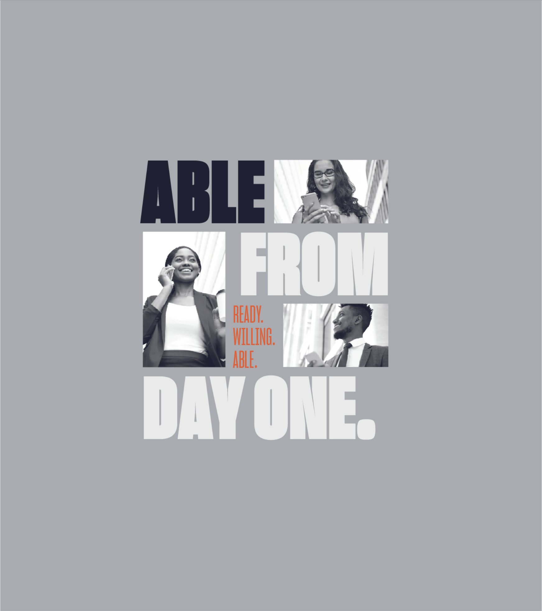
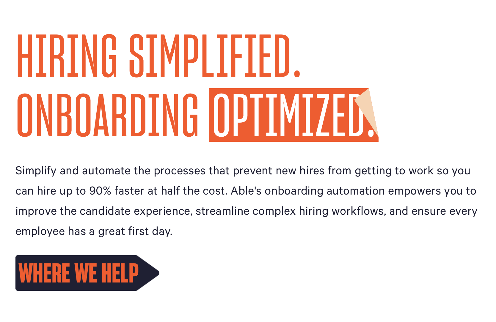
At the heart of the company was a simple promise: make people more able. Able to move faster. Able to focus. Able to show up with energy instead of paperwork fatigue.
This became the foundation of the rename and the launch of a brand built around empowerment. A name that captured the company’s mission and unlocked a brand built around human potential. We transformed them from Employstream, to Able.
Logo System
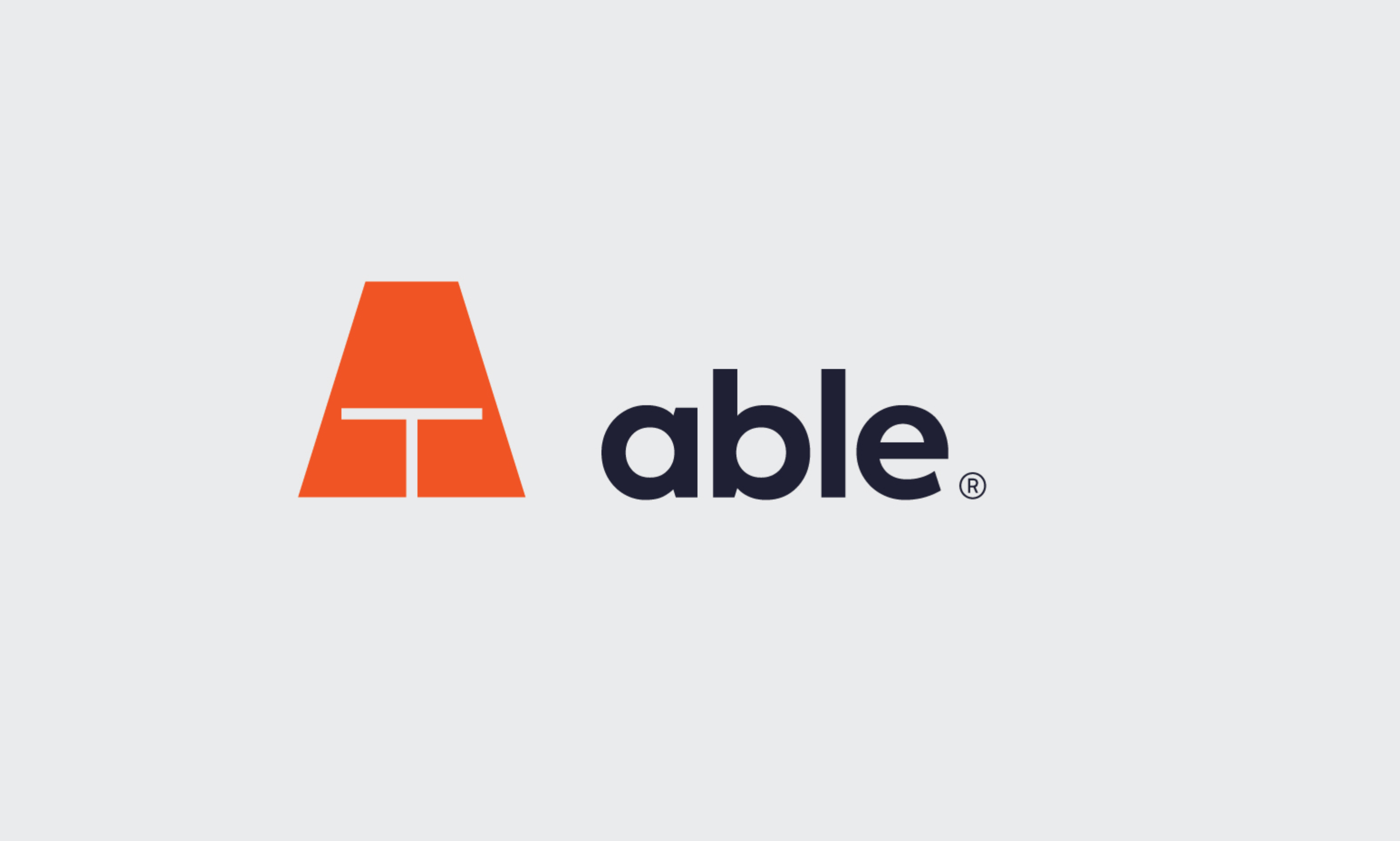
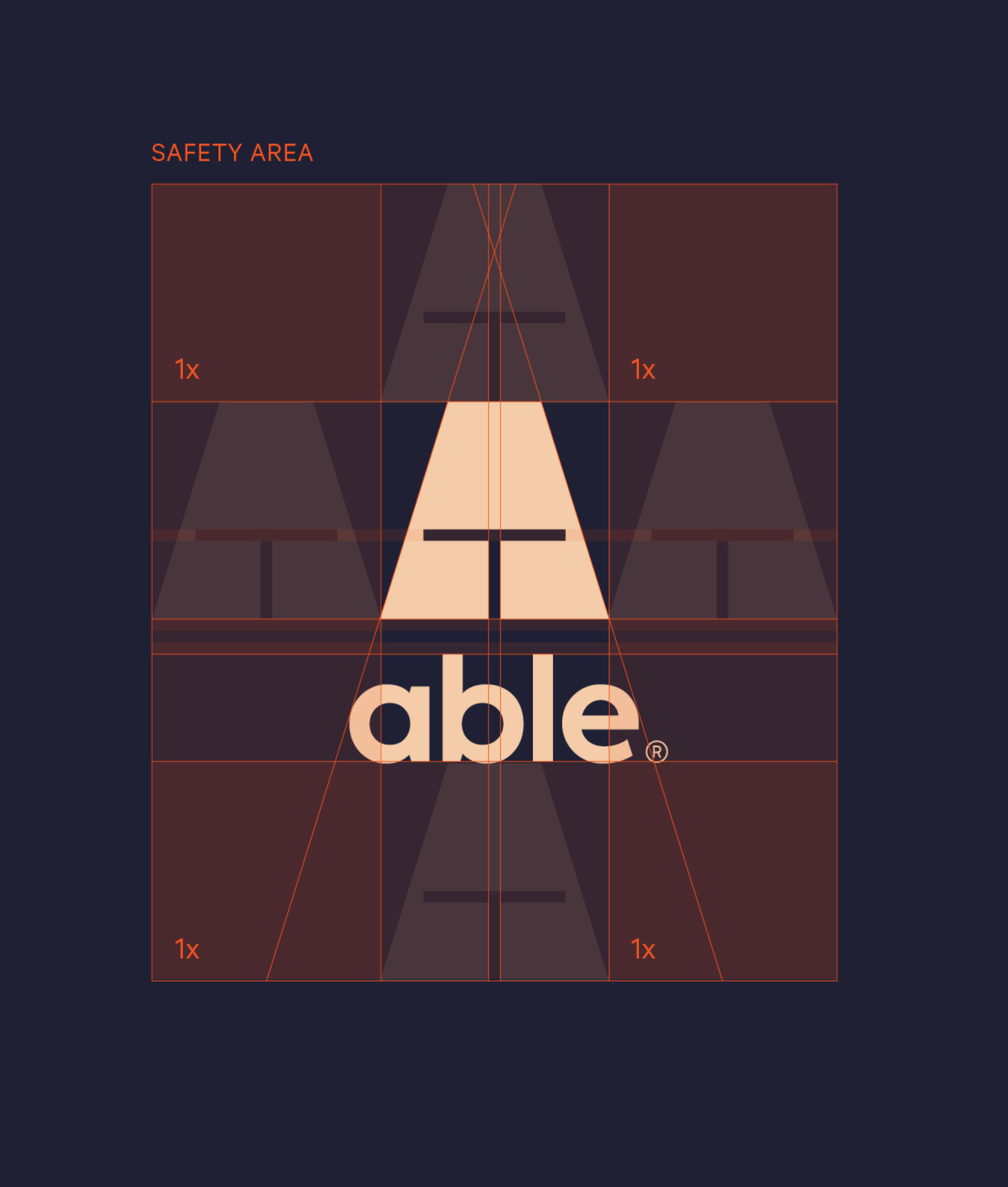

Empowerment was the north star. We needed a symbol that felt powerful, light, and inviting. Bold, but with a sense of ease. The final mark drew on a combination of ancient warrior helmets and the simple thought of a light hanging over a worktable, inviting people to collaborate.

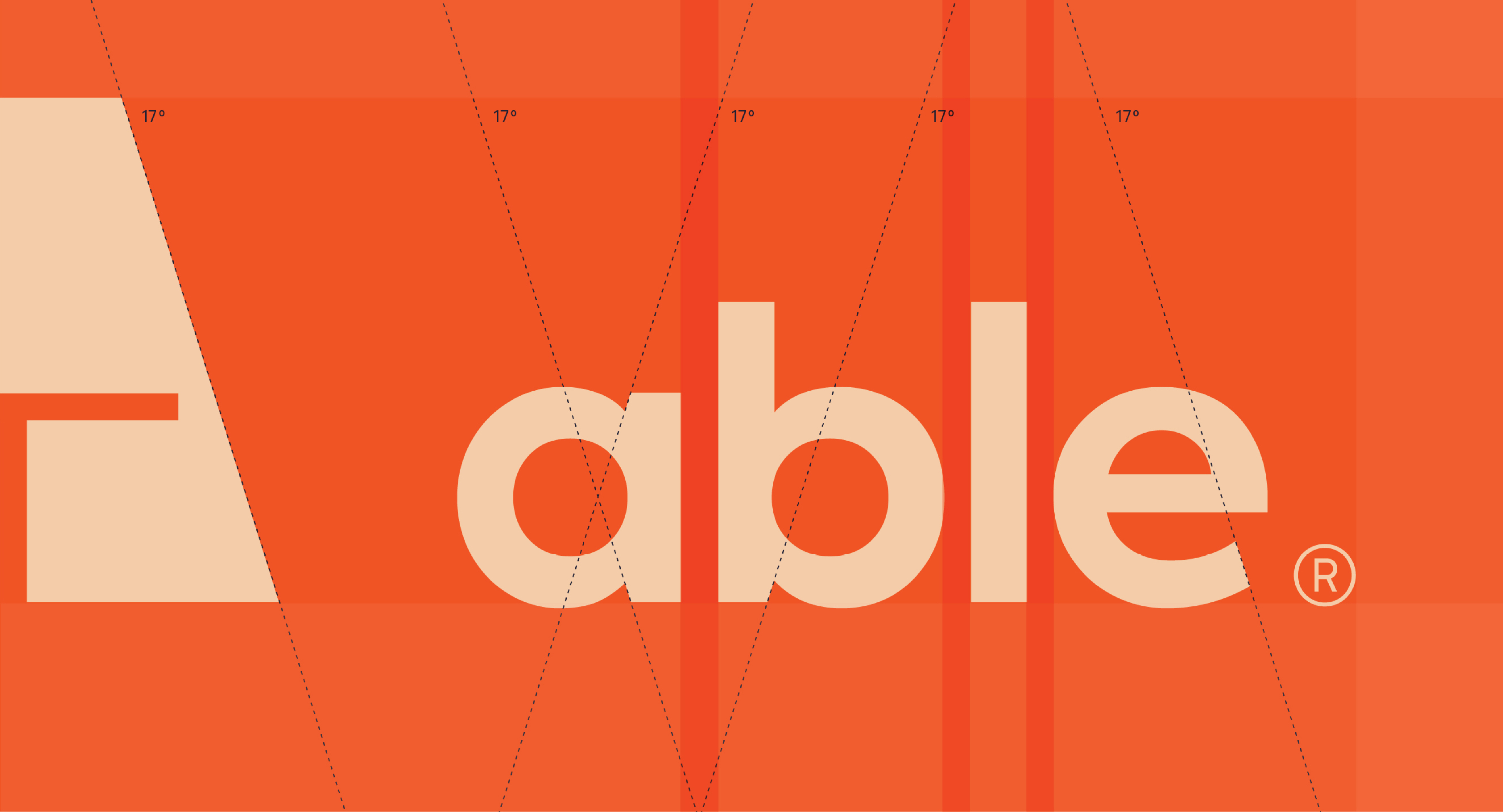
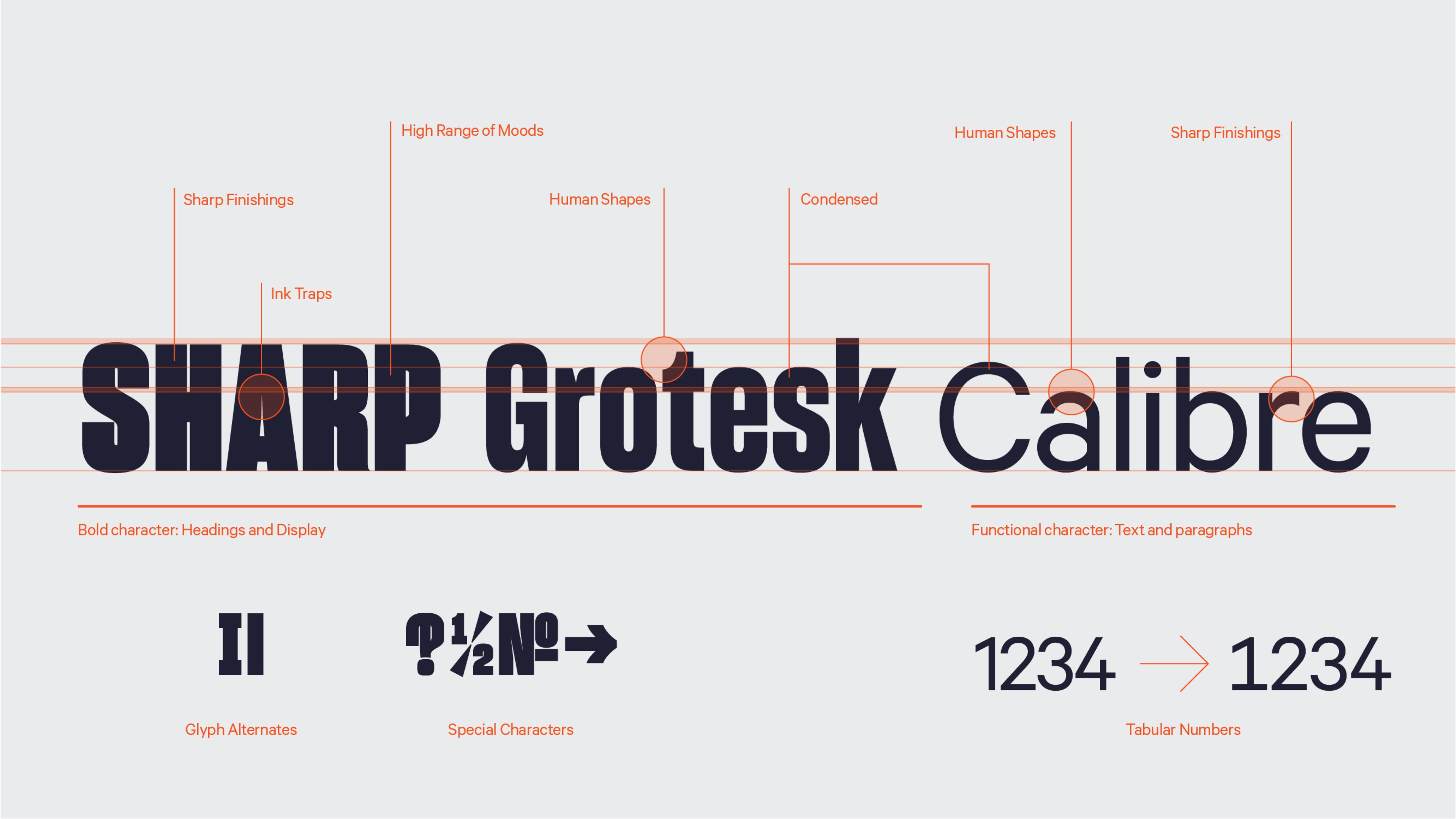
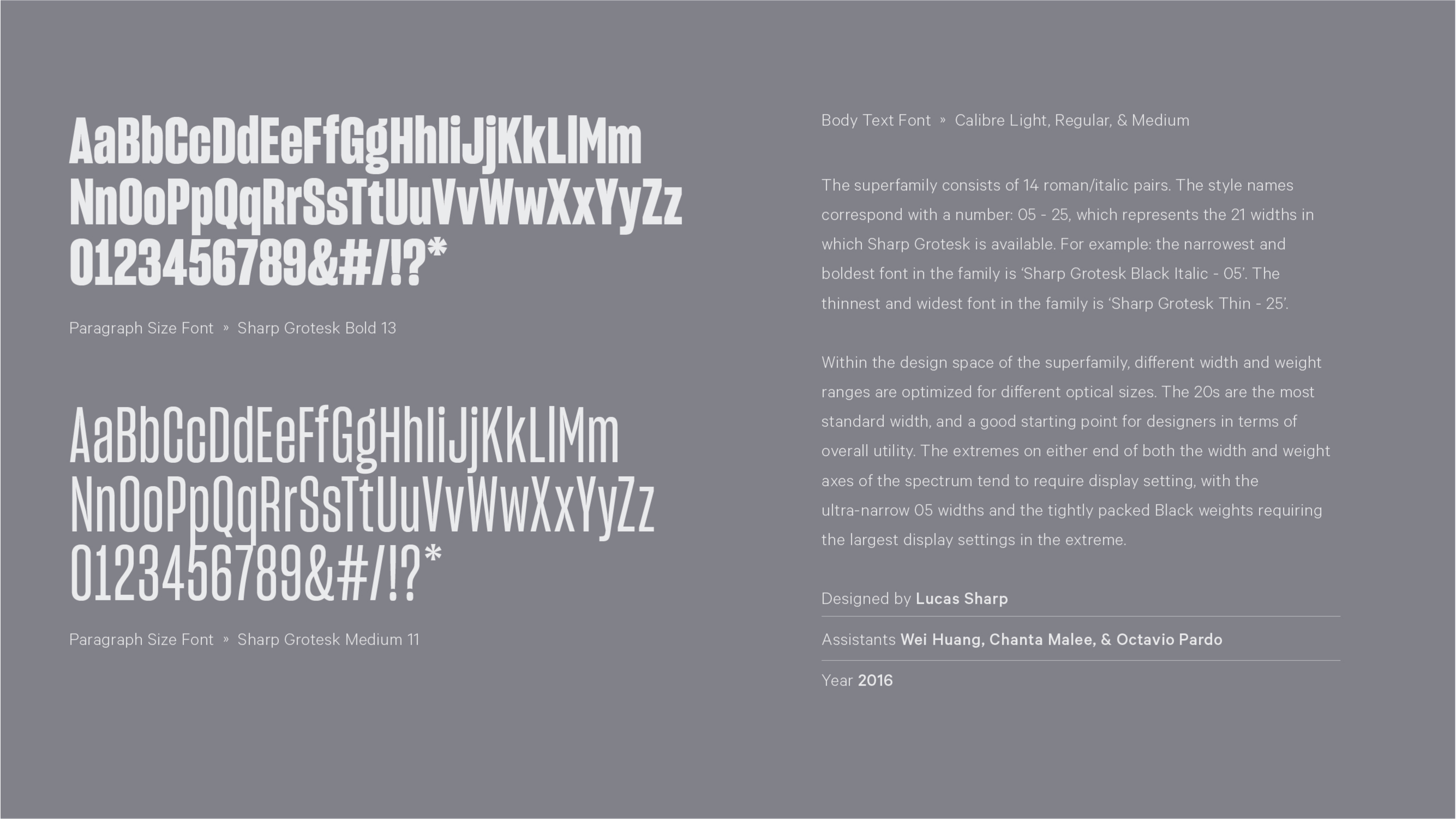
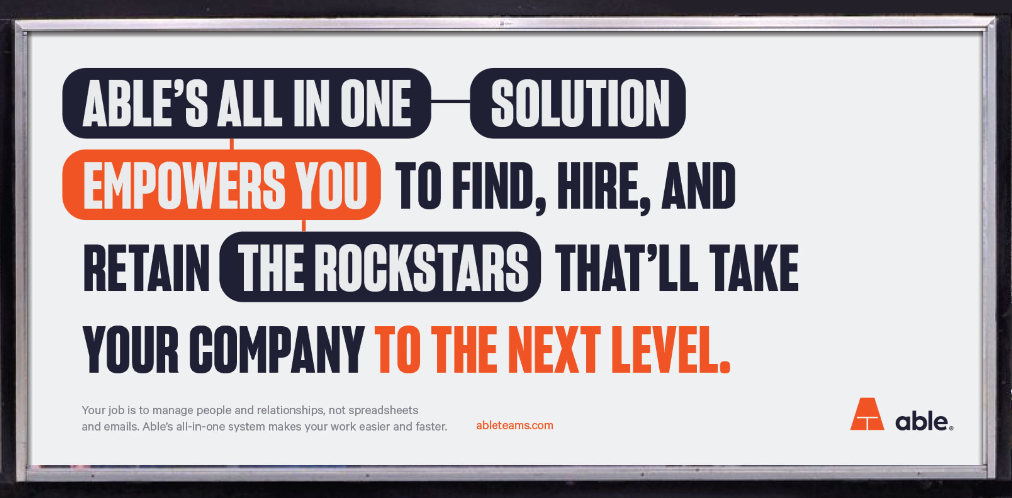
To balance the wide angle of the Able mark, the type system pushes in the opposite direction, using a tighter, condensed set of typefaces. This emphasizes the humanity of the brand and the sharpness of the detail-oriented functions the company provides. A strong contrast between heavy and light-weight further conveyed strength and clarity.
Typography System

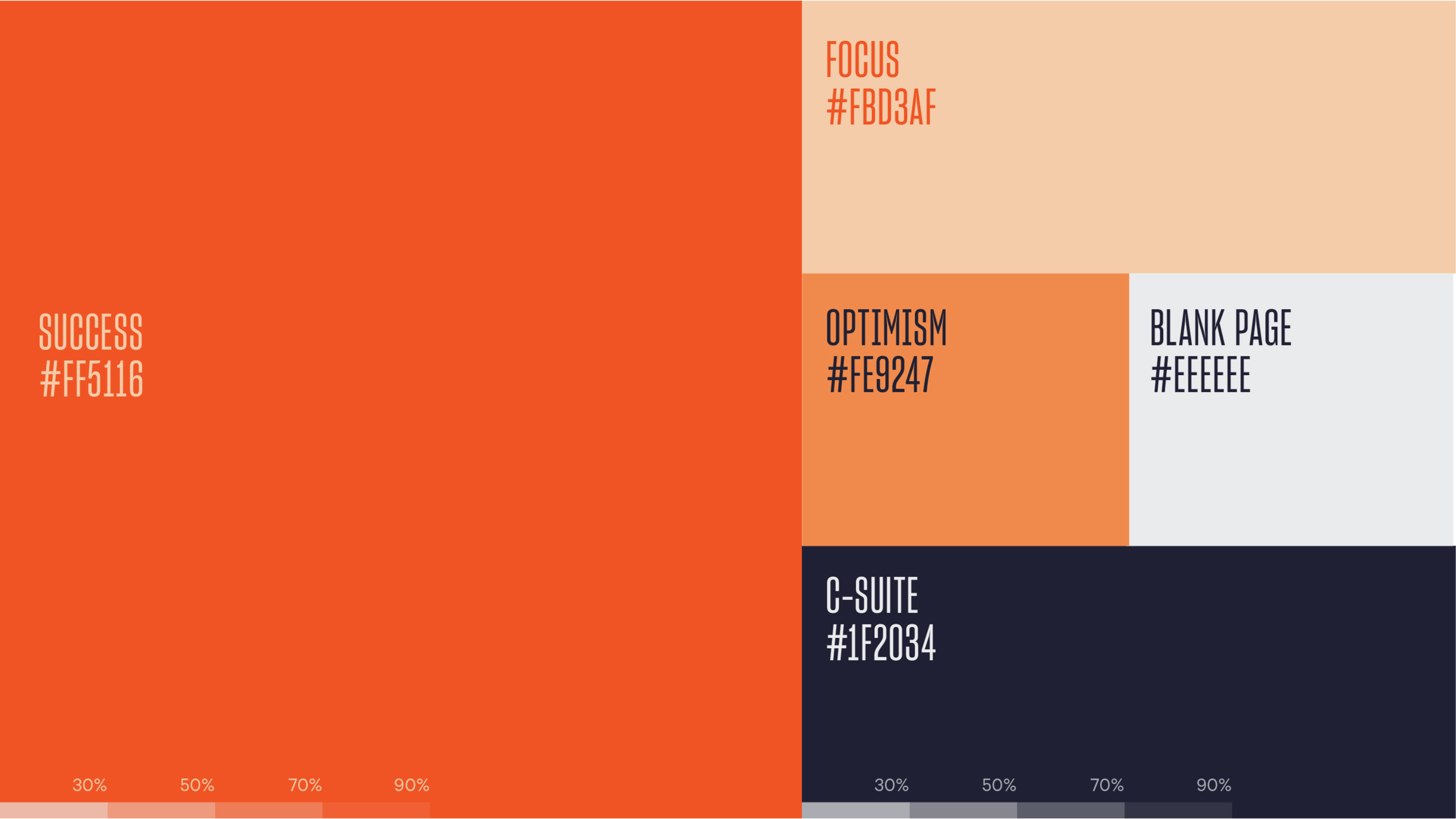
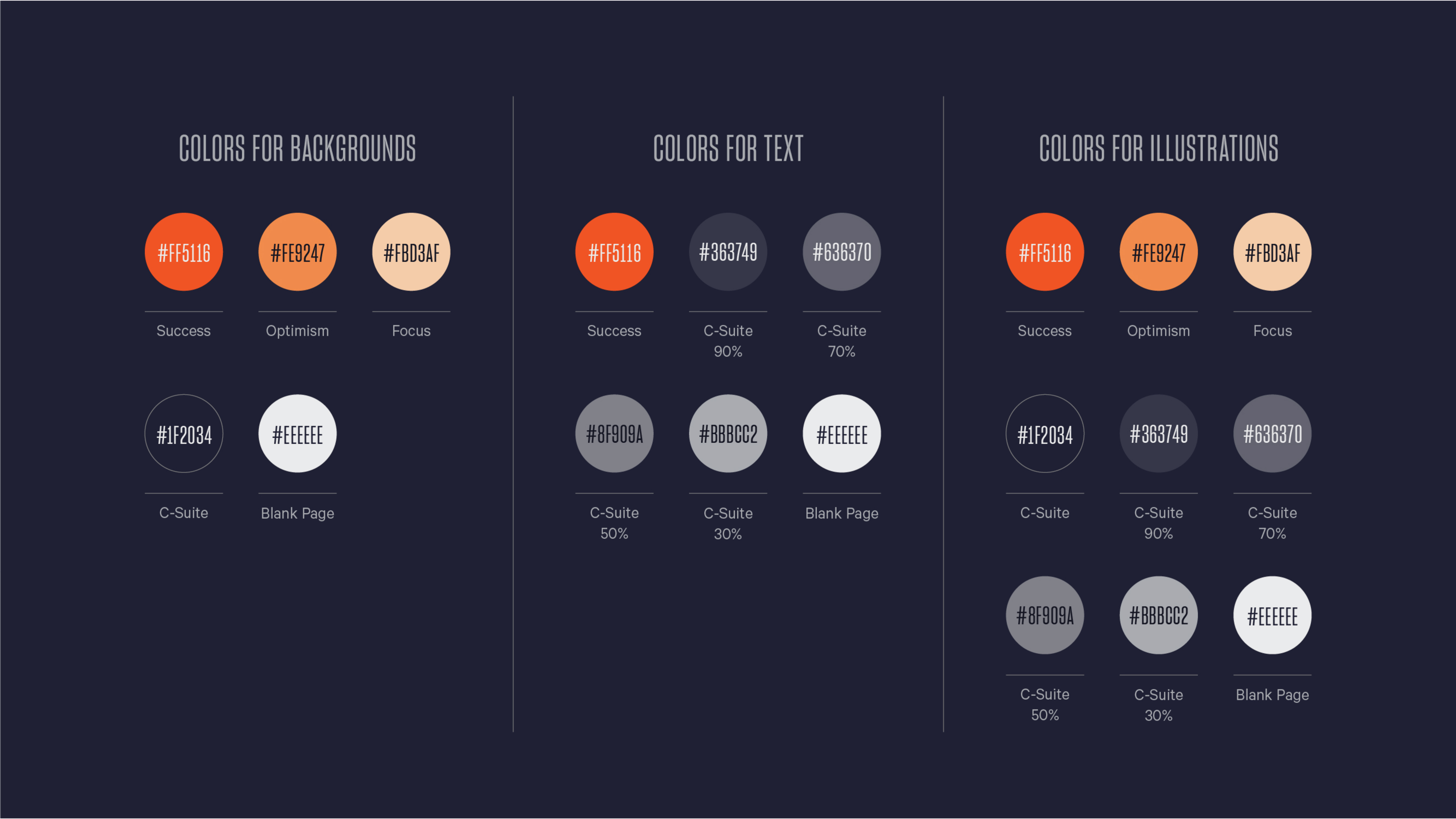
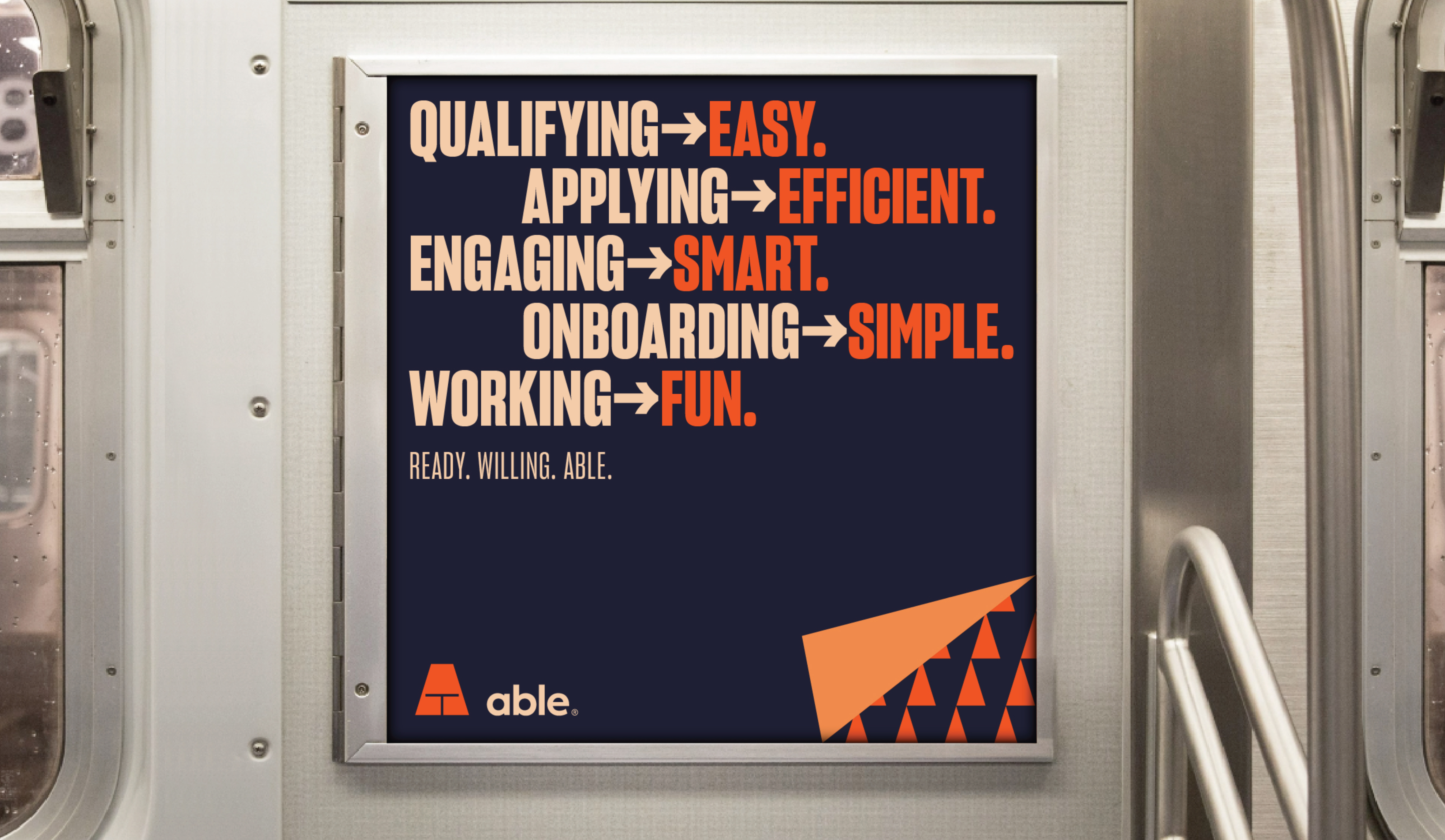
For the color system, we paired a bright, lively orange with a complementary navy instead of a standard black. The brand’s version of white was also not a pure white but a light gray. This allowed us to mimic the idea of office paperwork while staying modern and upbeat.
Color System
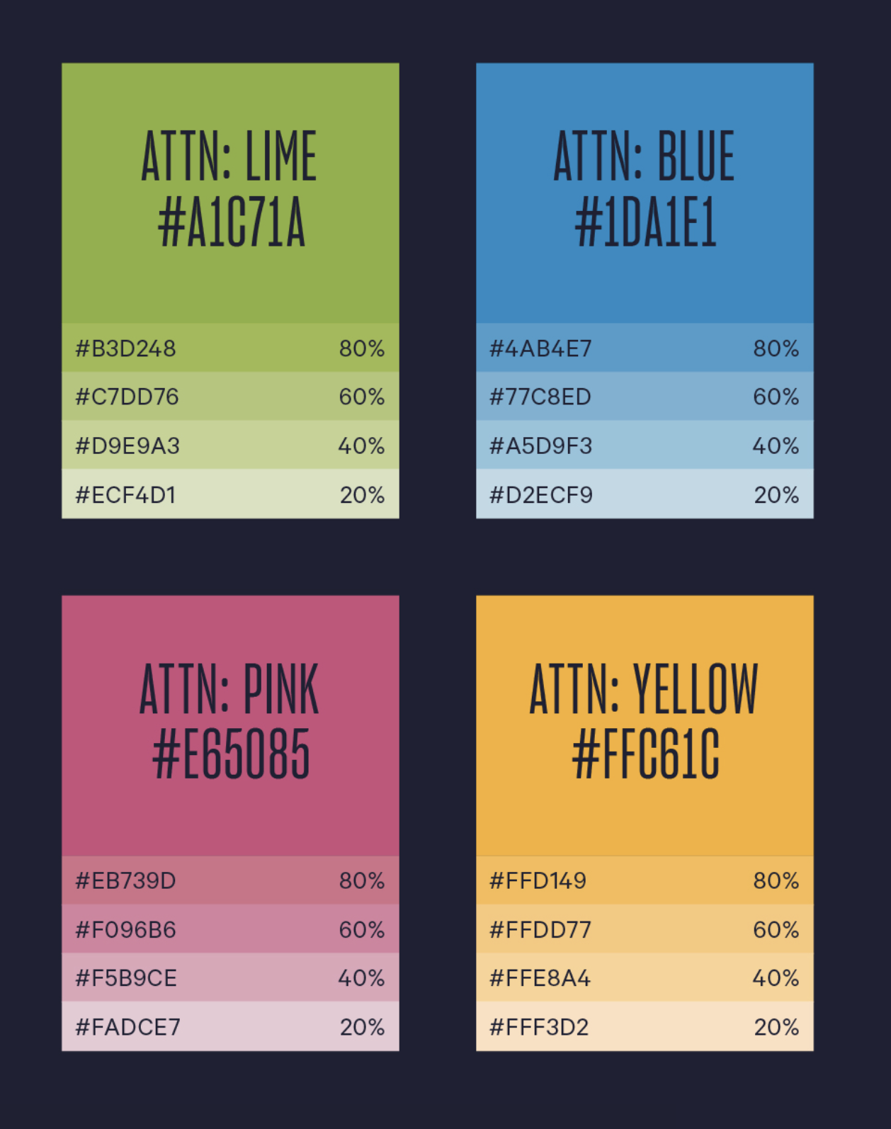
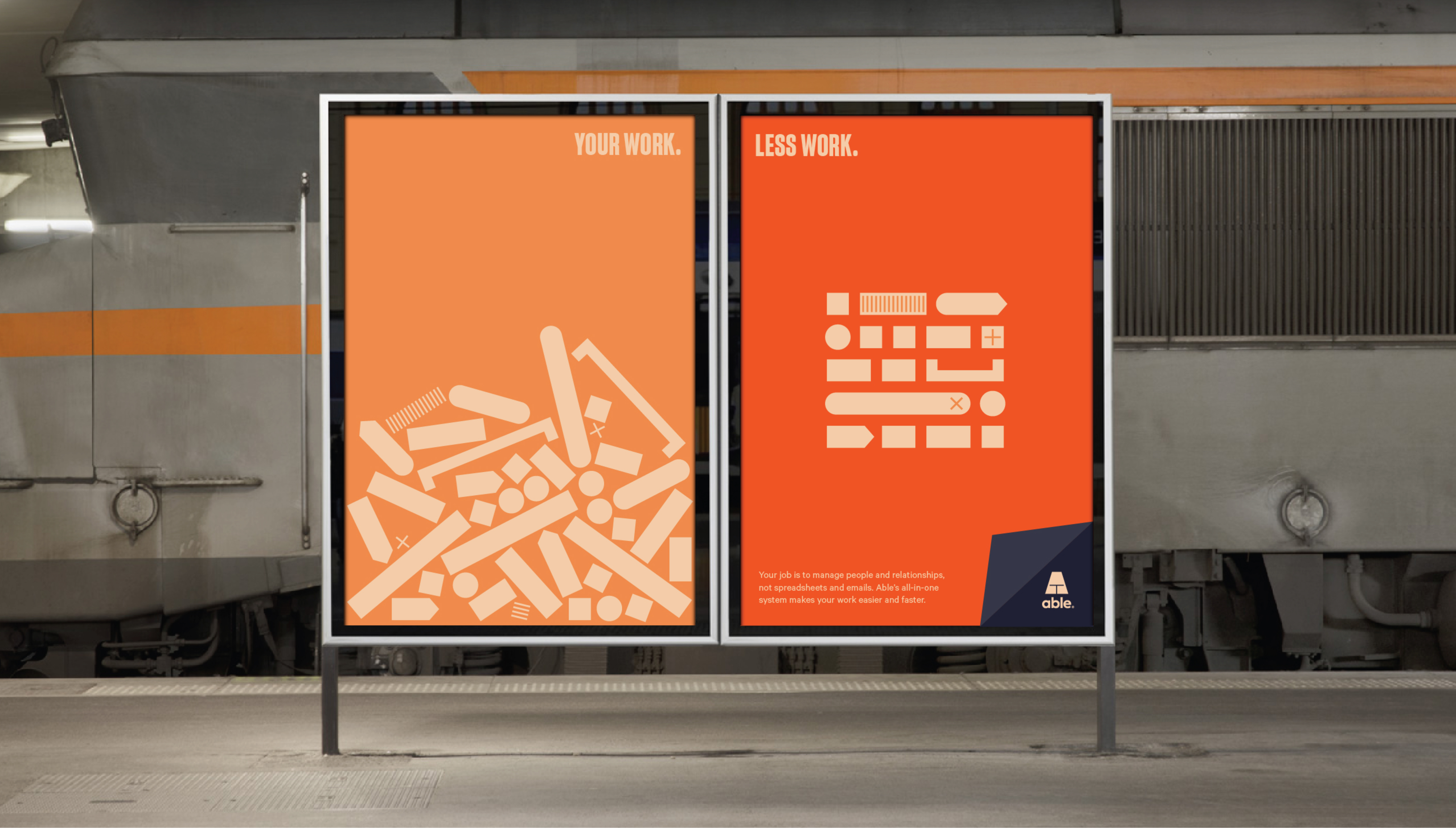
Extending the color palette was easy. Inspired by everyone’s favorite office supply, sticky notes!
This unlocked a playful range of bright accents that became a signature across the brand.
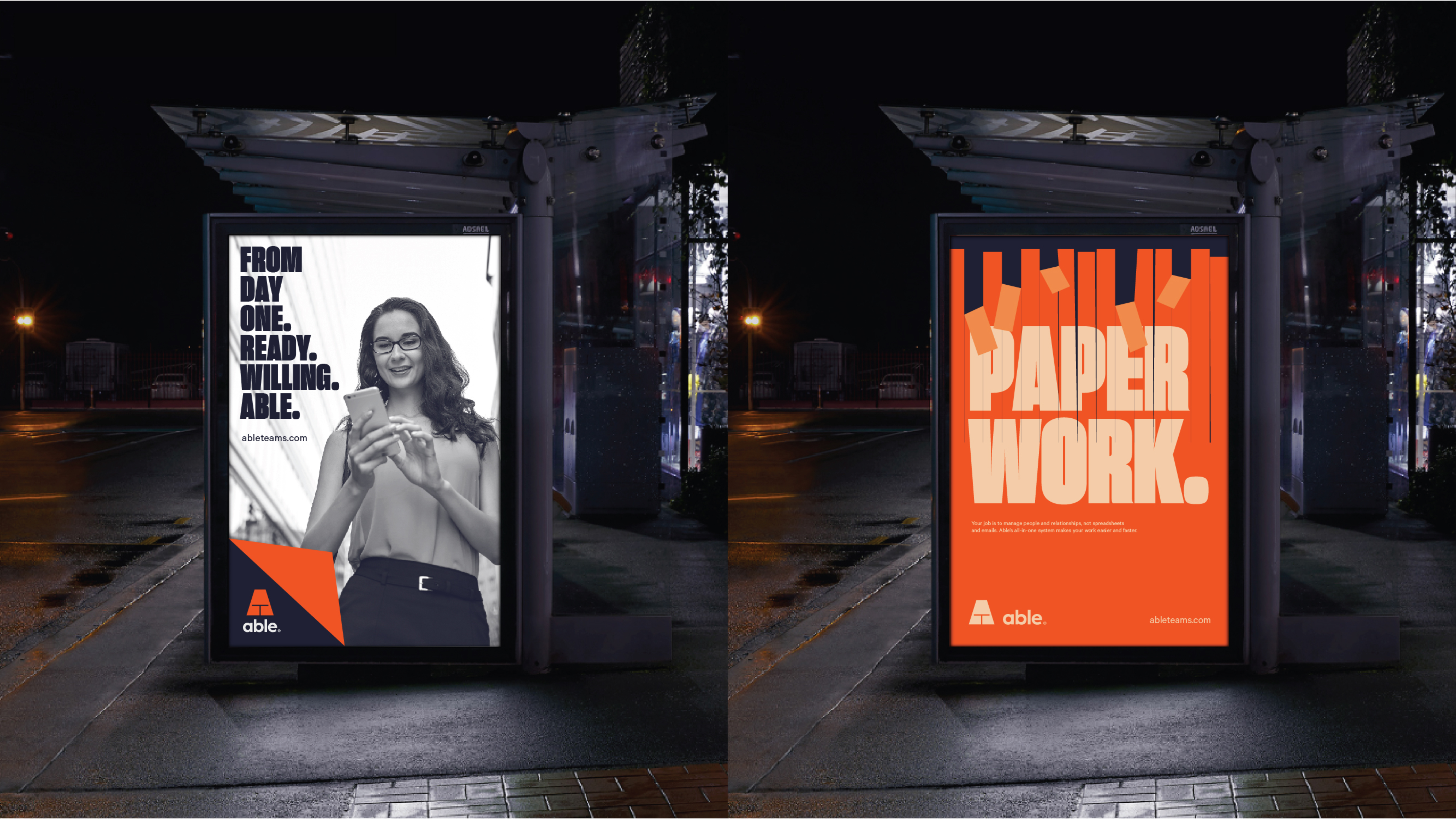
It also took us down a path of converting familiar office tropes into design conventions as we developed the brand elements.
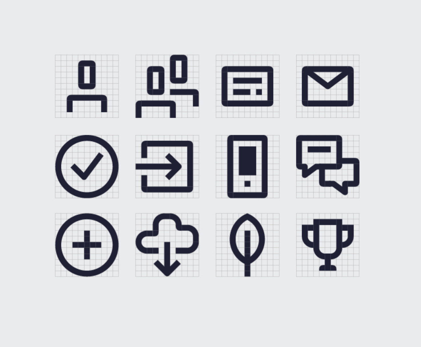
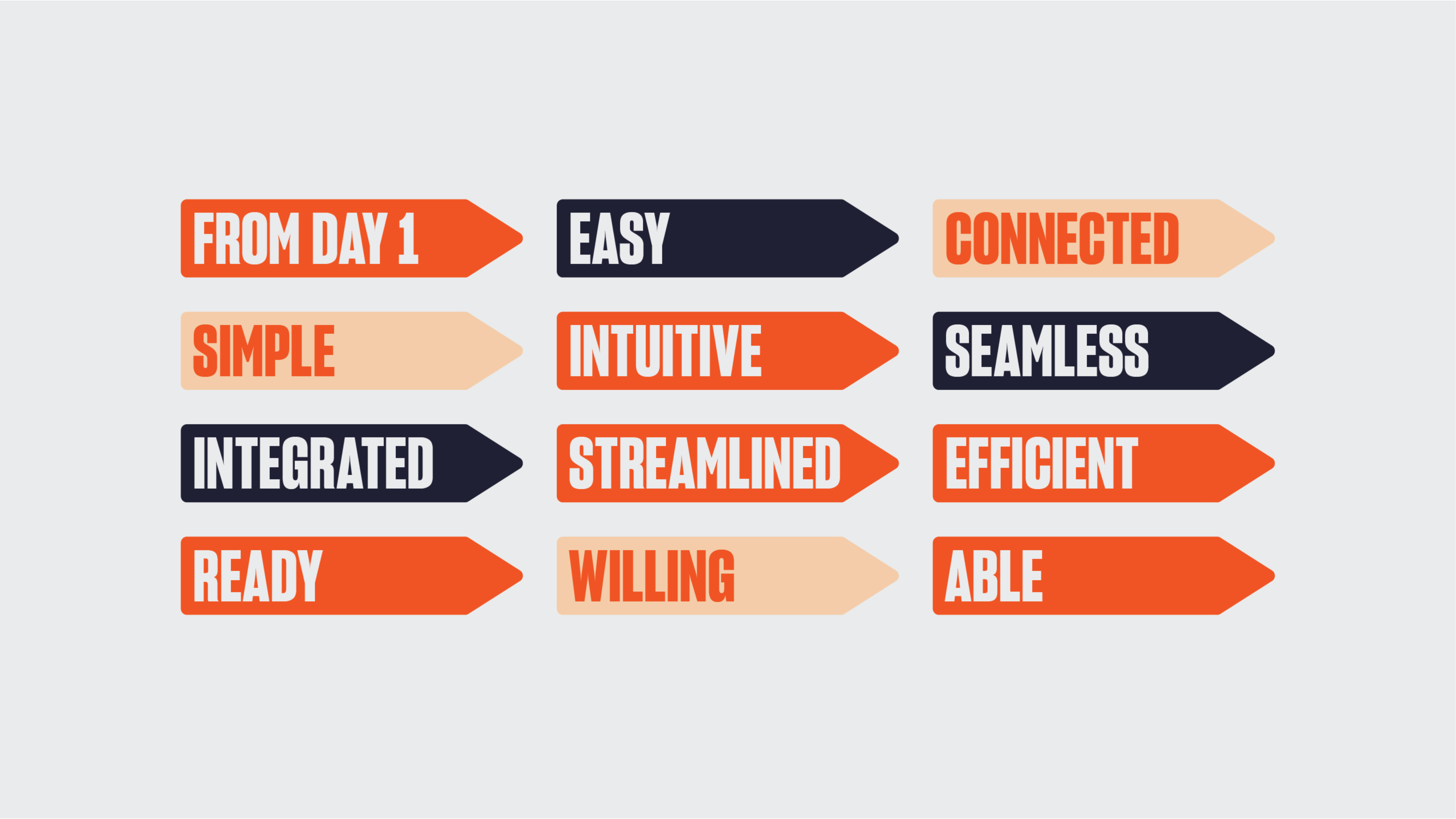
The iconography draws from early computer icon styles. Simple, pixel-inspired forms, updated to feel fresh and friendly. This mirrored Able’s promise of technology that makes things easier.
The illustration style brings the idea of becoming superpowered to life, giving people comic-like proportions and poses. And the idea of turning the page both literally and figuratively became a key graphic device.
Icons, Illustration, And More


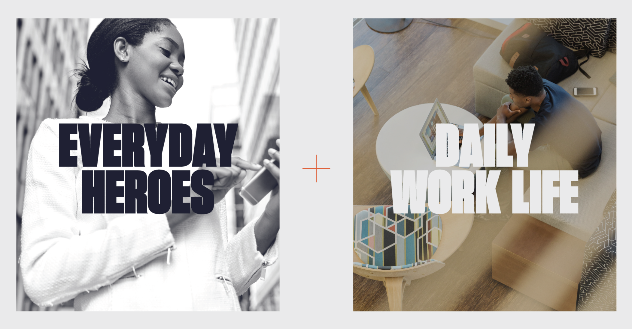
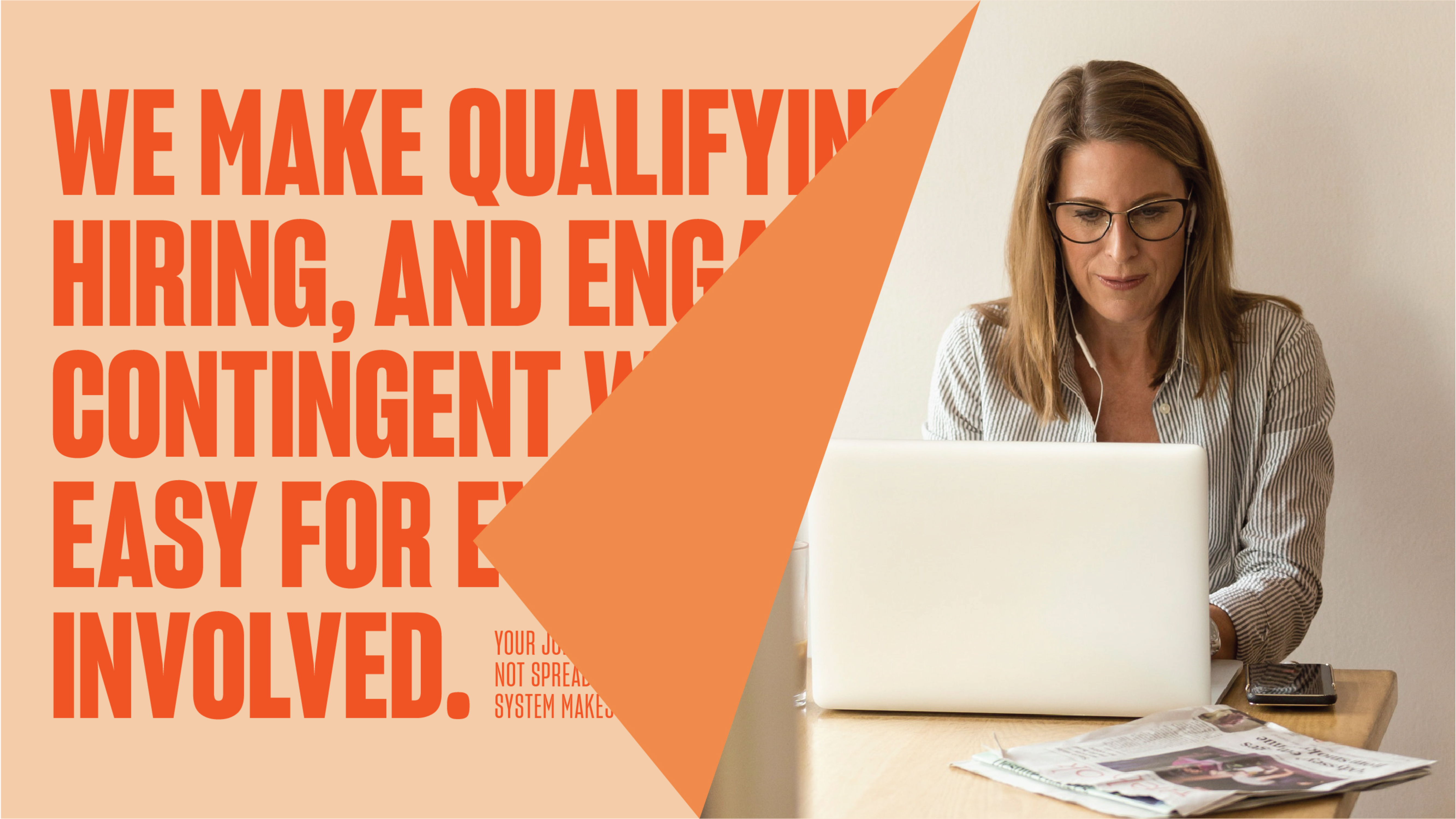
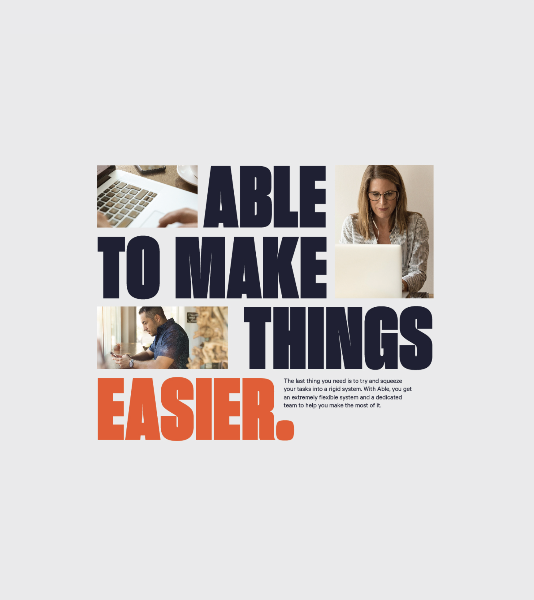
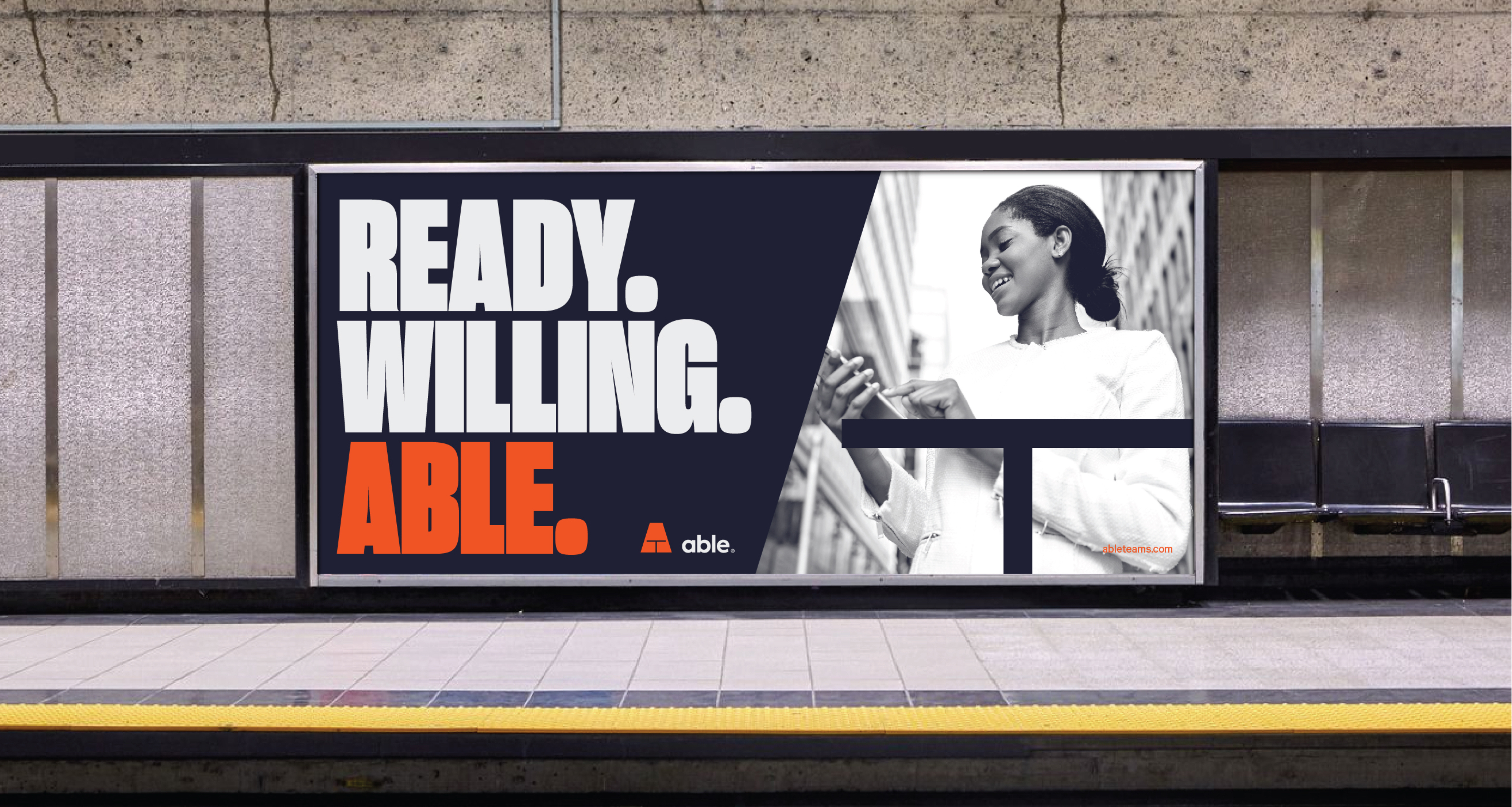
With photography, the heroic theme rose to the occasion. Shots captured people from strong angles or in focused action. Everyday workers portrayed with confidence and capability. Real humans doing real work, but elevated.
Photography Style
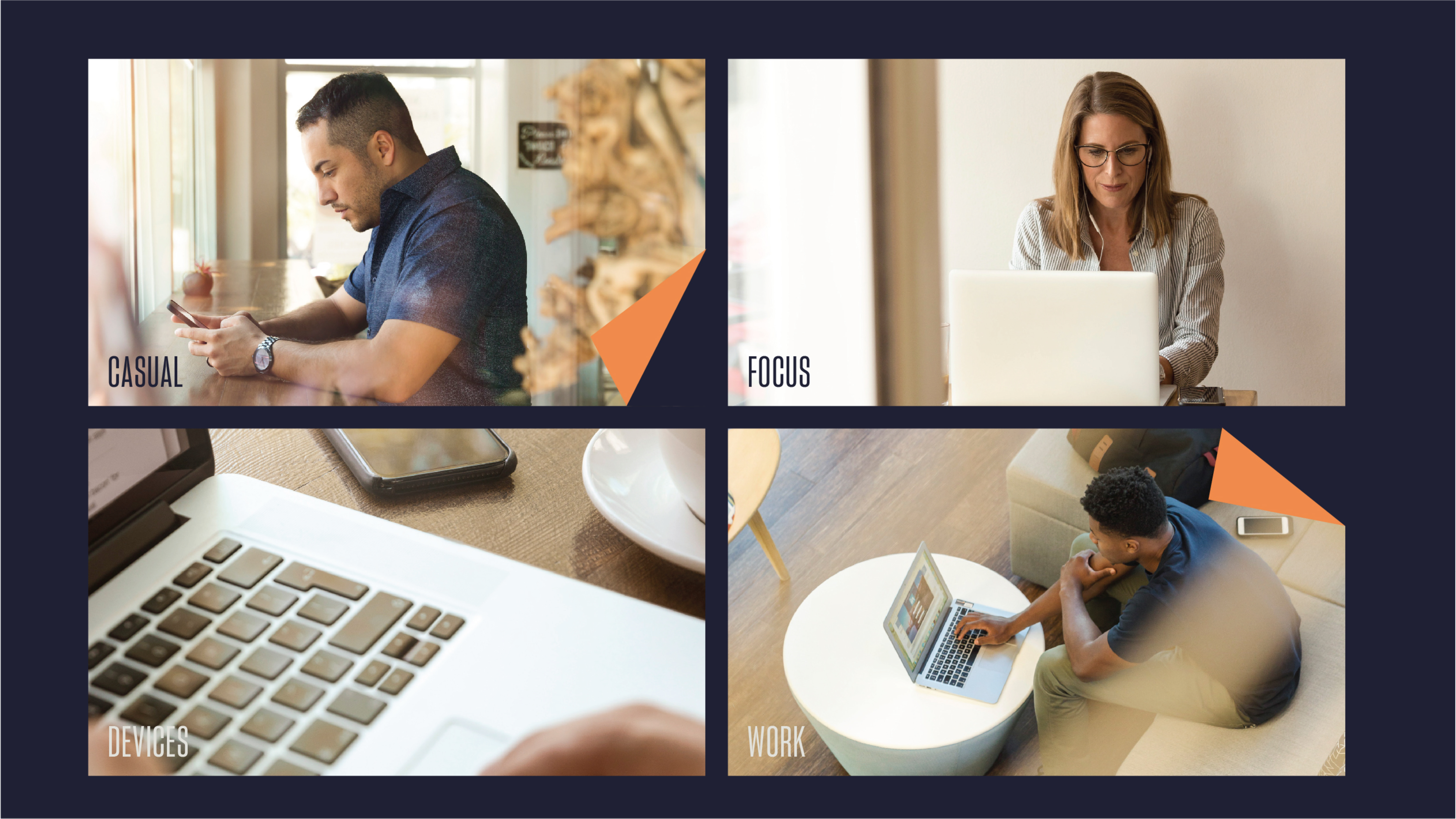

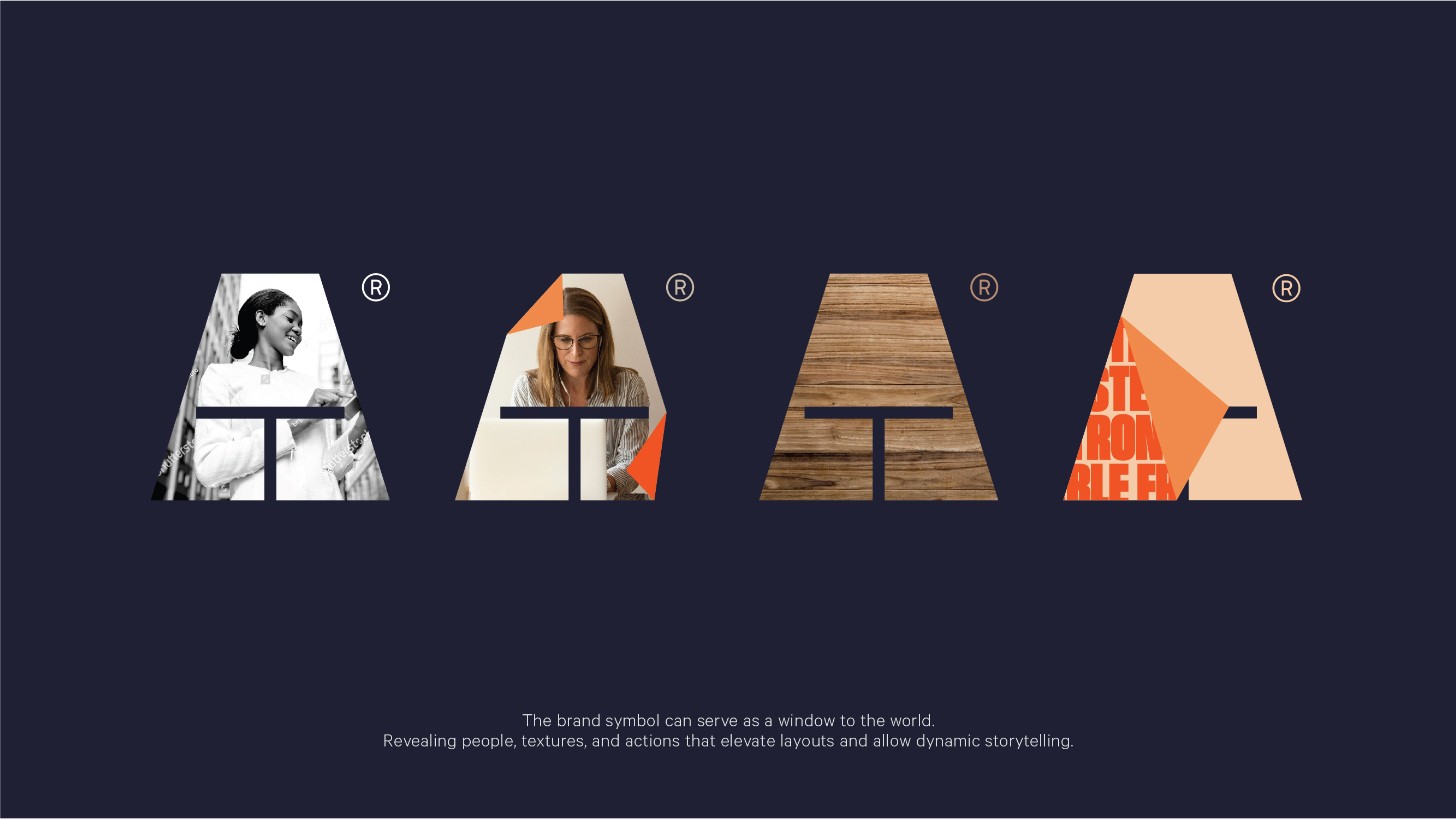
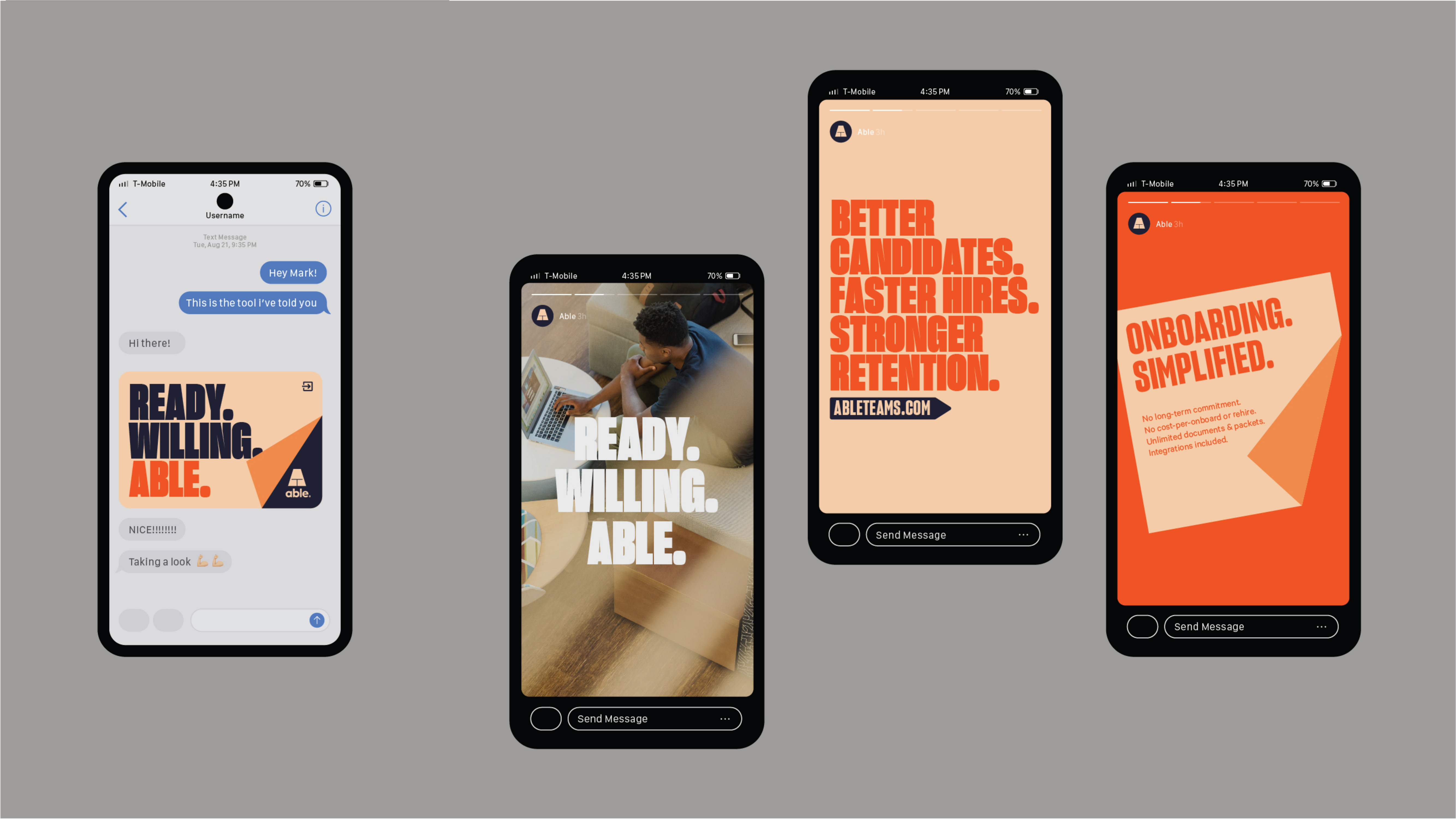
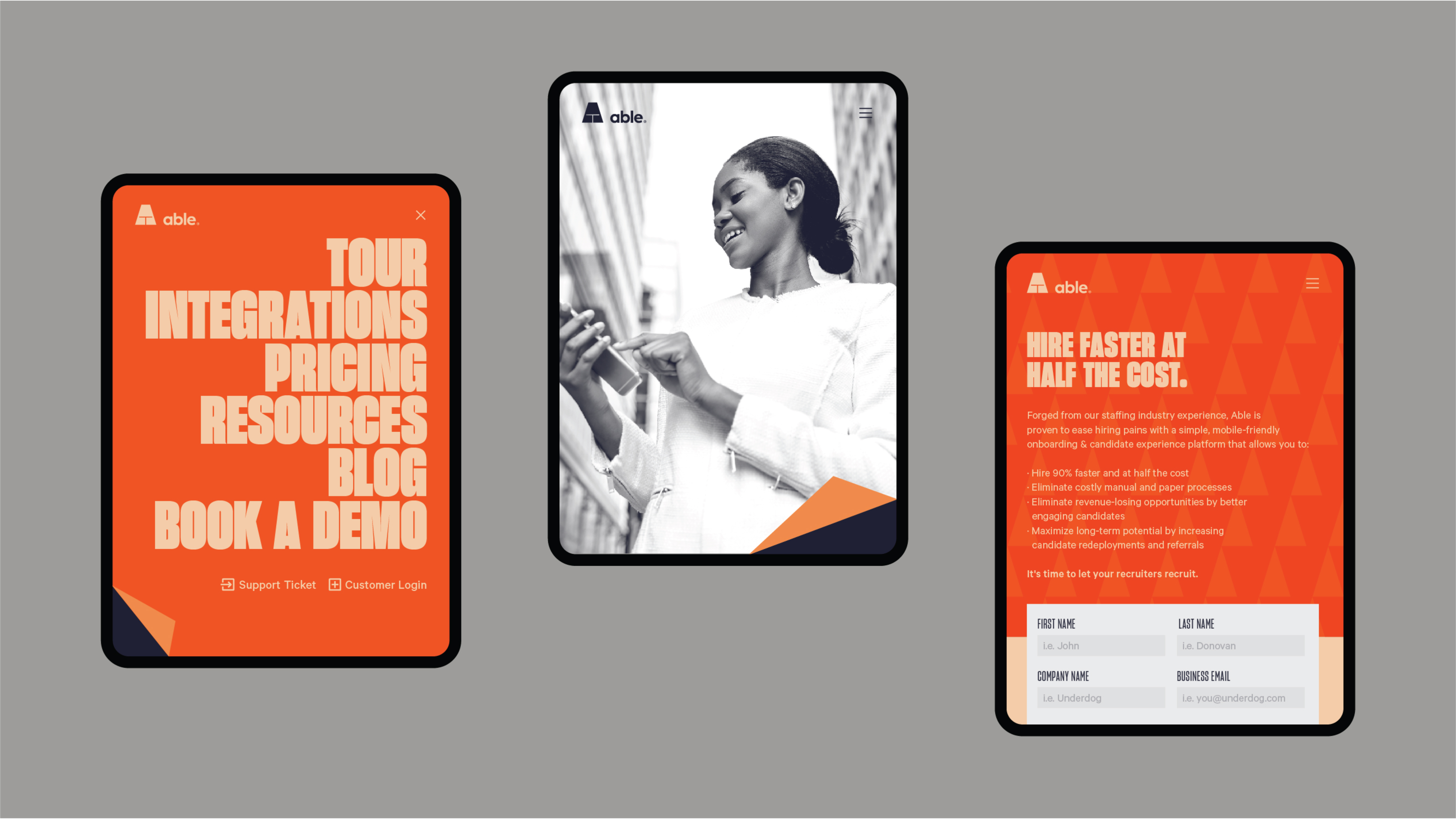
The Able mark itself became a container for photography, allowing reveals, motion-driven transitions, and a dynamic framing system. This expanded the brand’s expressive vocabulary across channels.
Expanding the Brand
Able’s smart stack of tools needed a naming system that blended seamlessly with the new parent brand. We used alliteration and returned to our sticky note inspiration to create a clear, fun hierarchy. It was important that it felt like distinct tools within one cohesive suite, just like departments within an organization.
Verticals / Services


Each name stood alone but flowed together when presented as a system, reinforcing how the tools worked independently and collectively.
Tone of Voice
With the visuals coming together, we needed to lock in a voice that had conviction, clarity, and a human pulse. We focused messaging on the emotional reality of starting a new role. The excitement, momentum, and desire to dive in. And while there’s something a bit cliché about day one of a fresh start, for Able, that meant we could leverage another cliché in their favor. A familiar phrase associated with new beginnings that perfectly aligned with the brand’s purpose.
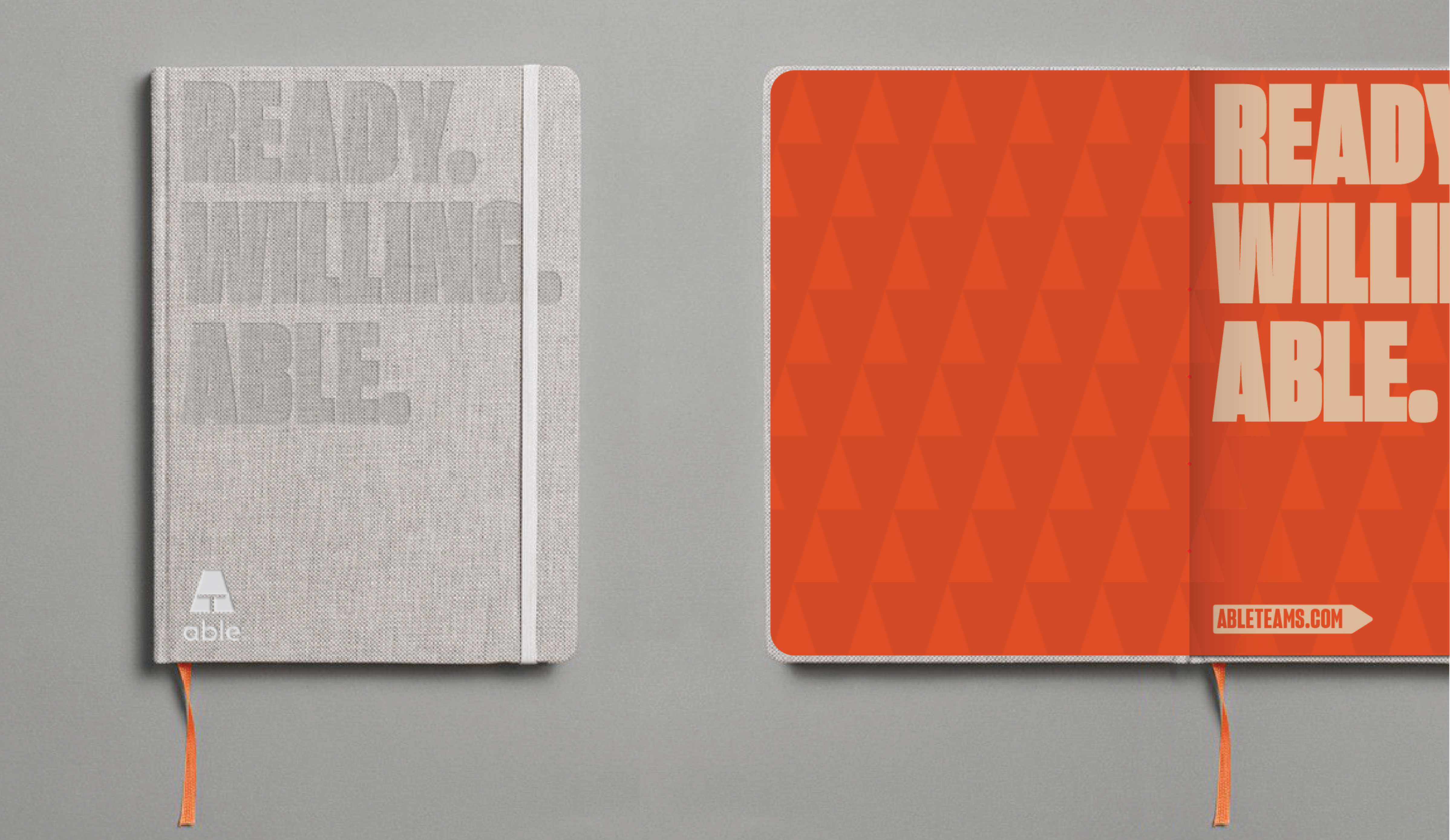
“Ready. Willing. Able.”
Because with Able, everyone who was ready and willing really did become able too.
Tagline & Messaging


Putting It All Together
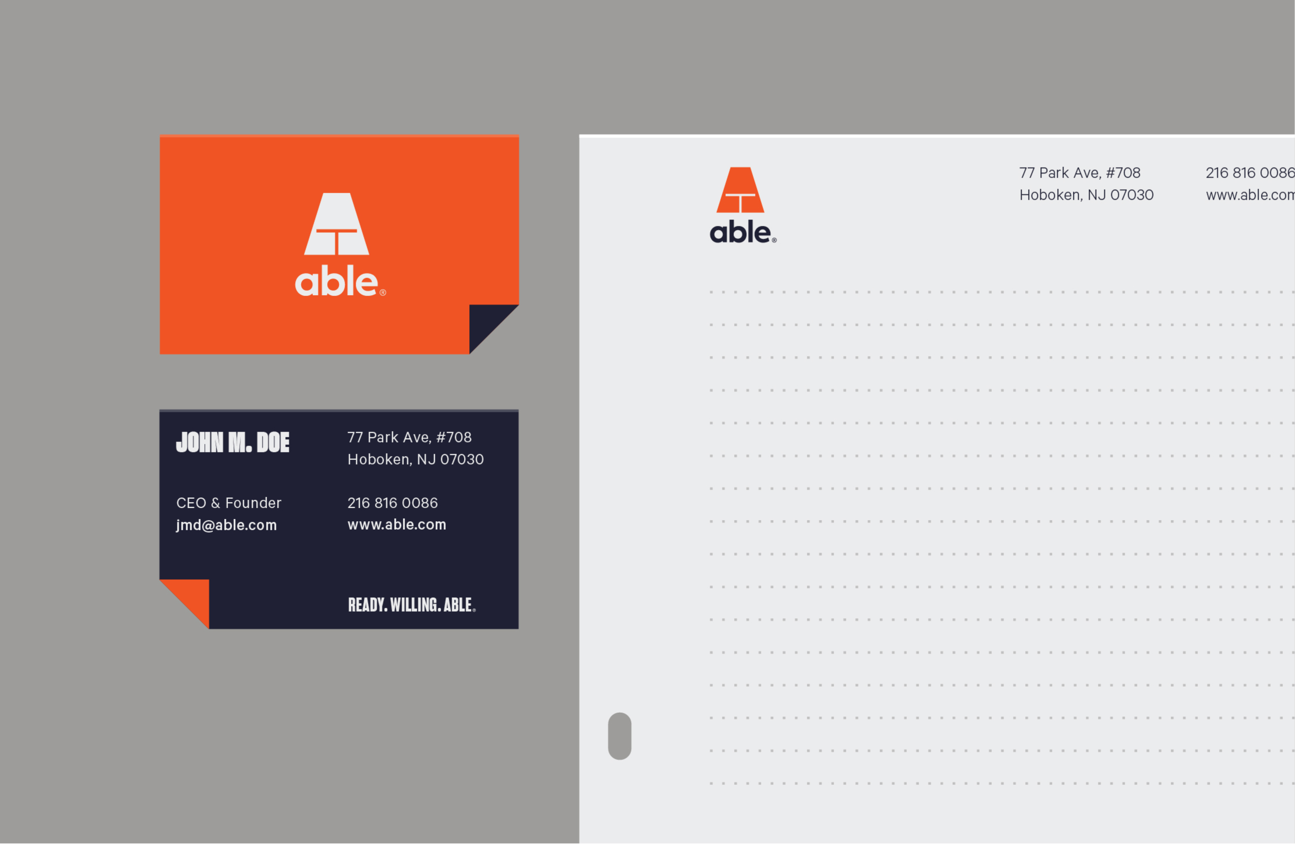
The brand came to life across office supplies, onboarding folders, stationery, and all the everyday items that define work life. Pops of color kept things fun, and the page-turn detail tied everything together.
The brand balanced cleanliness with charm.
The Brand at Your Desk
As the system expanded, the everyday symbols of office life became part of the visual toolkit — flowcharts, gantts, contract flags, even shredded paper. The system flexed. Photography framed within the Able mark created dynamic layouts. The graphic devices kept the brand easy, bright, and unmistakably Able.
The Brand In The World


Beyond Marketing
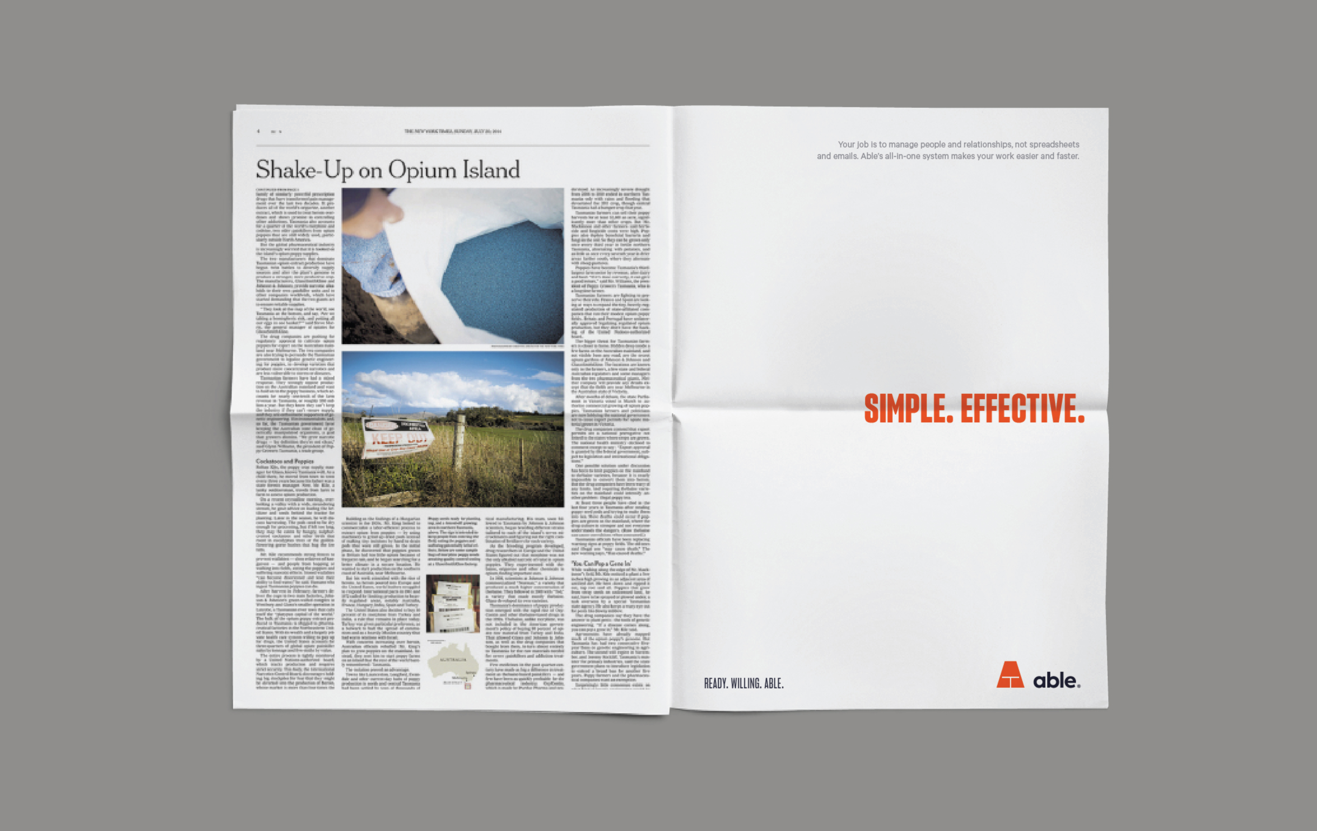
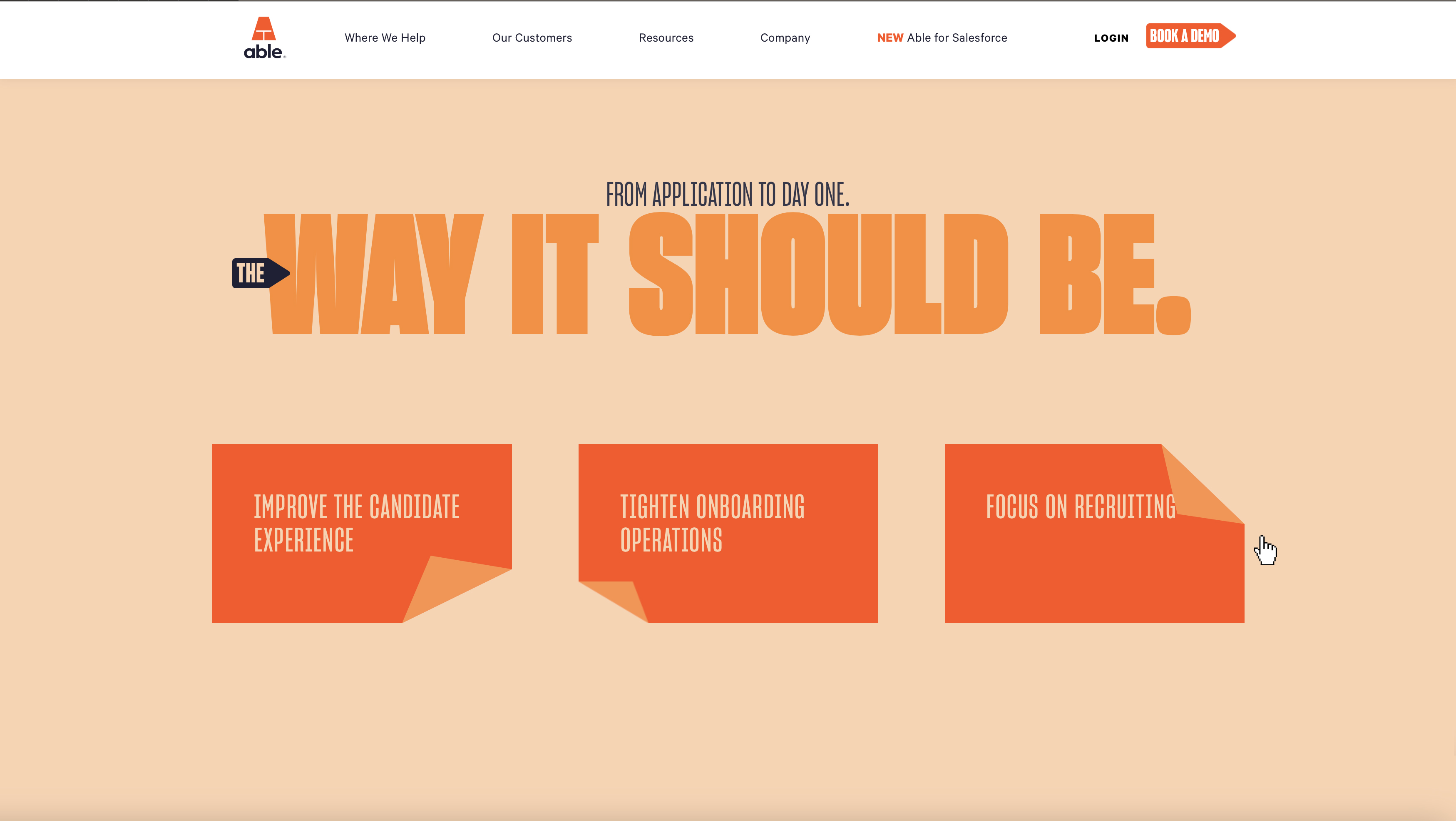
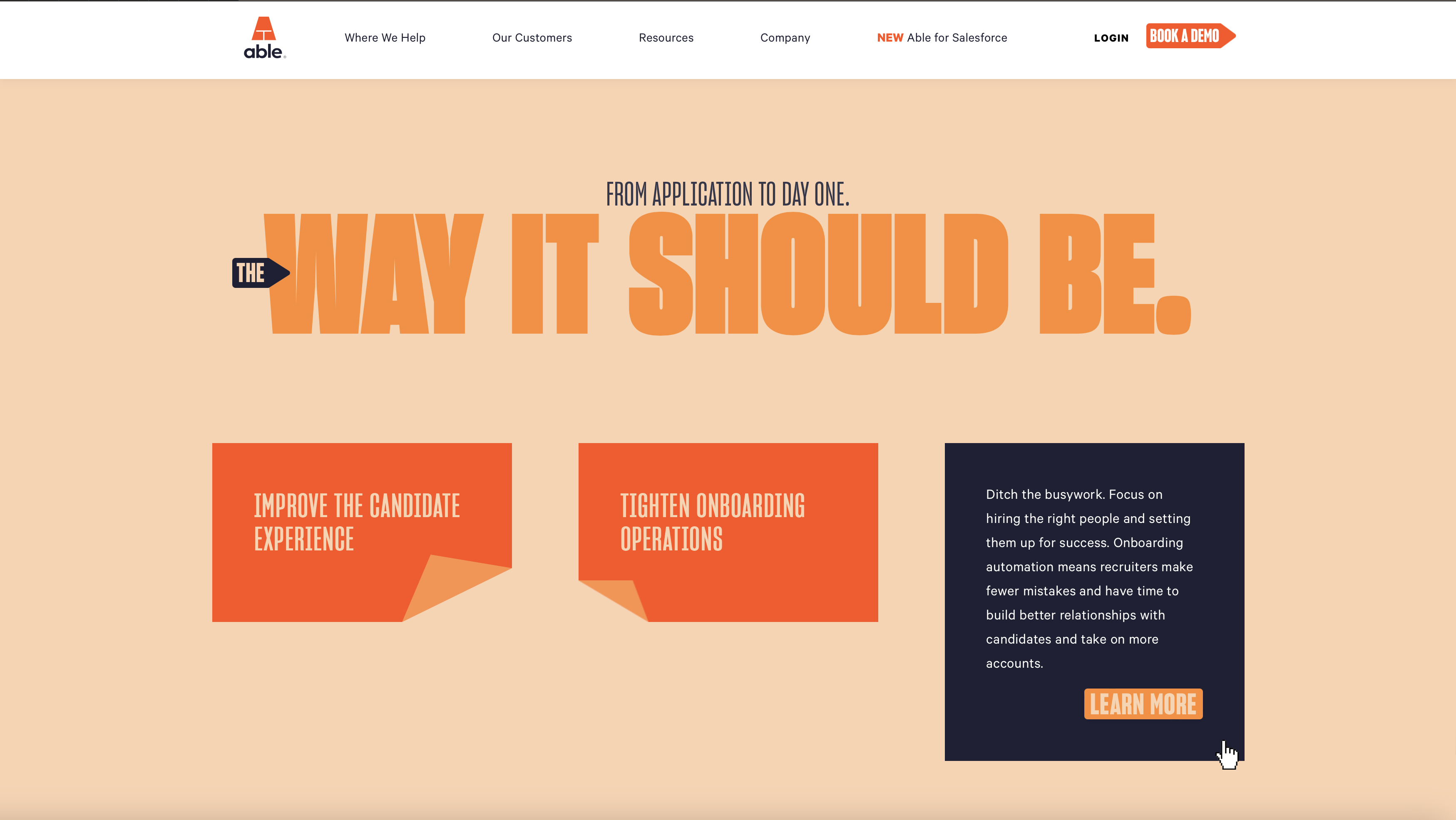
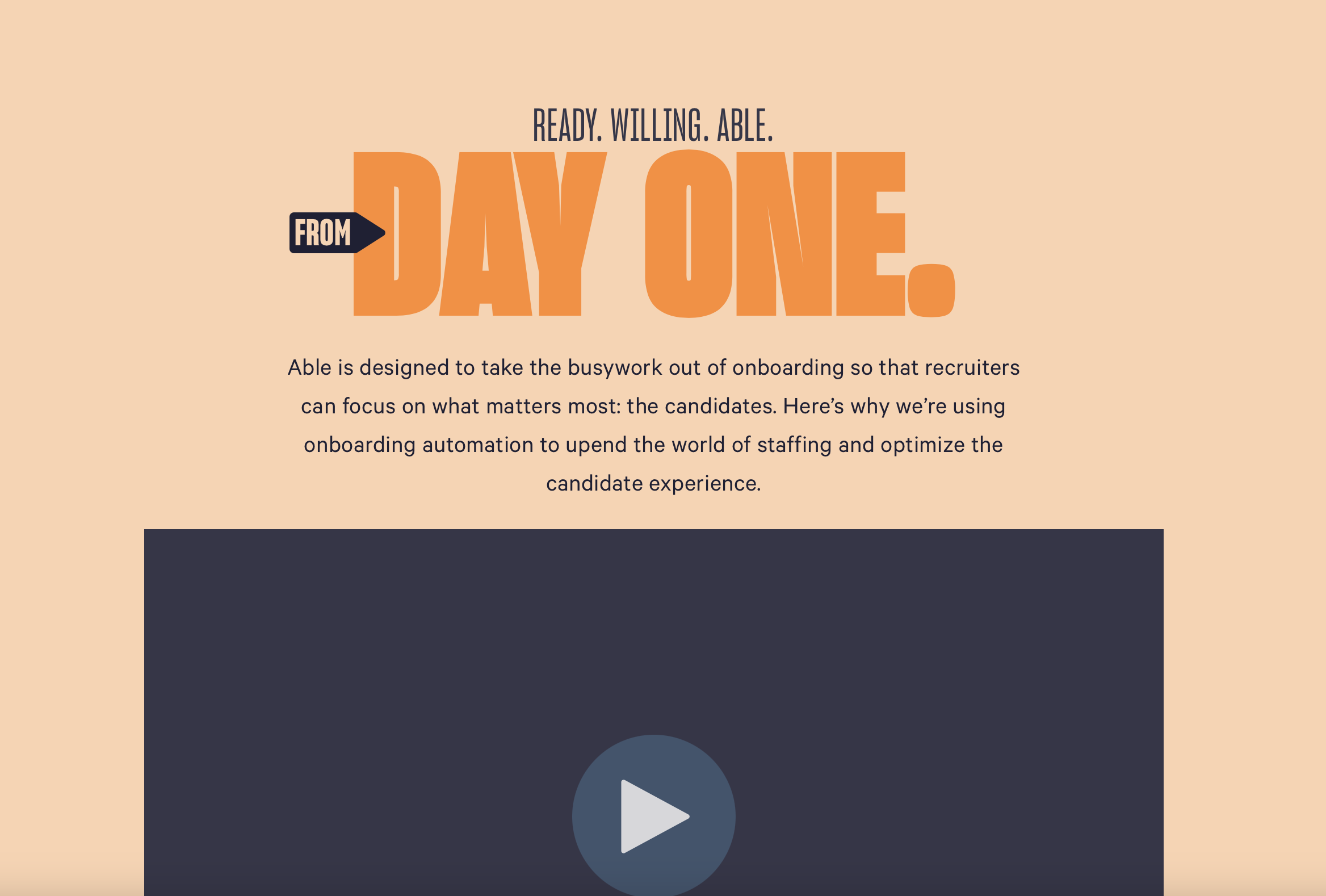
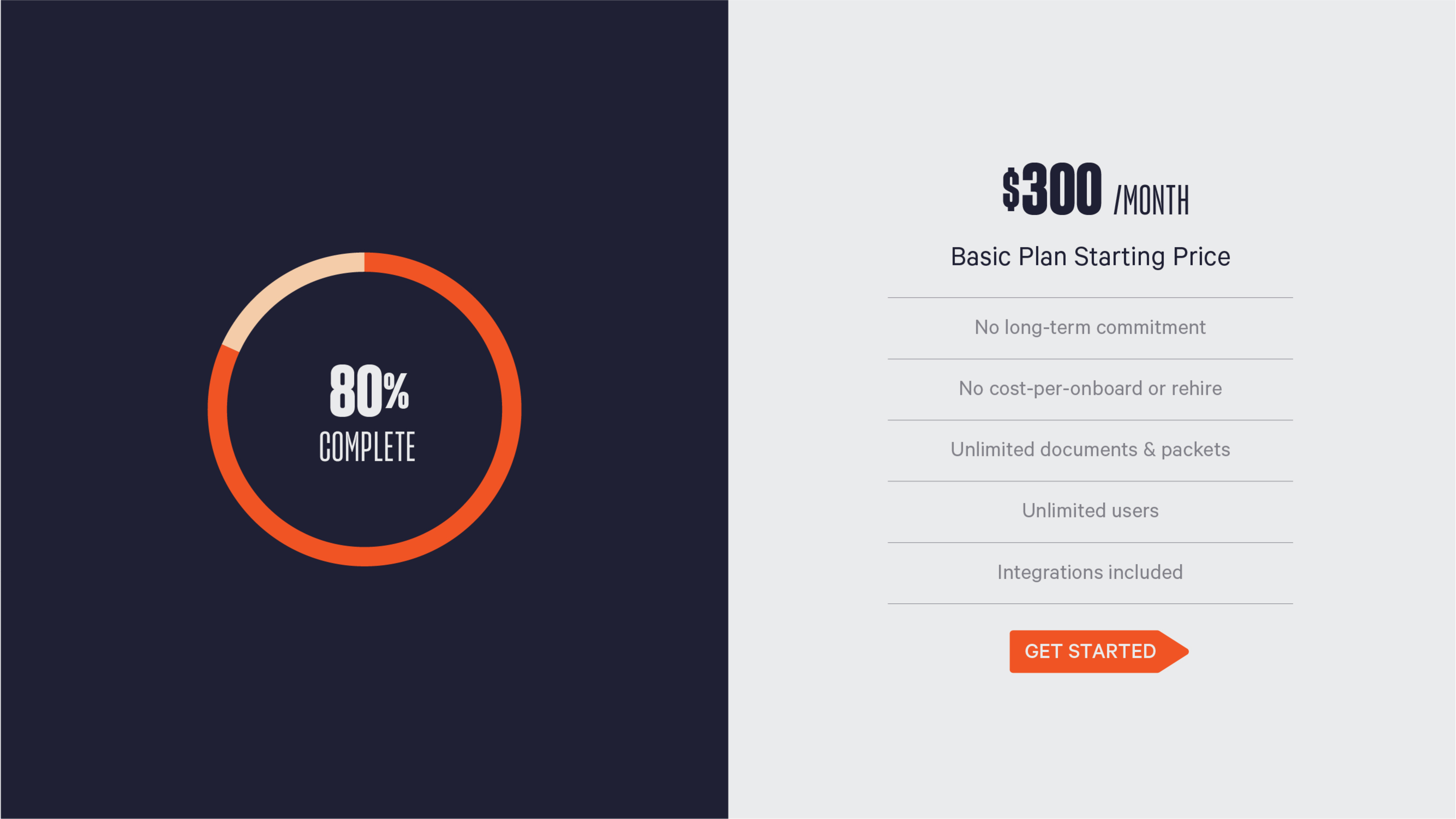
From physical materials to digital experiences, Able implemented the system with impressive precision. As a SaaS company, their digital execution mattered most. It was a space where the Brand Framework was really brought to life. Some clients drop the ball here, cluttering the experience and trying to use every element to explain everything all at once. Not Able.
The digital experience lived up to the brand’s ethos. It was organized, clean, and kept things digestible and simple. It used every element without overusing them.
The Brand In Your Device


Beyond a Startup Brand
In the end, the transformation paid off. The brand helped propel them to acquisition by Bullhorn, and was so telegraphic that Bullhorn seems to have adopted Able’s branding as part of their own.
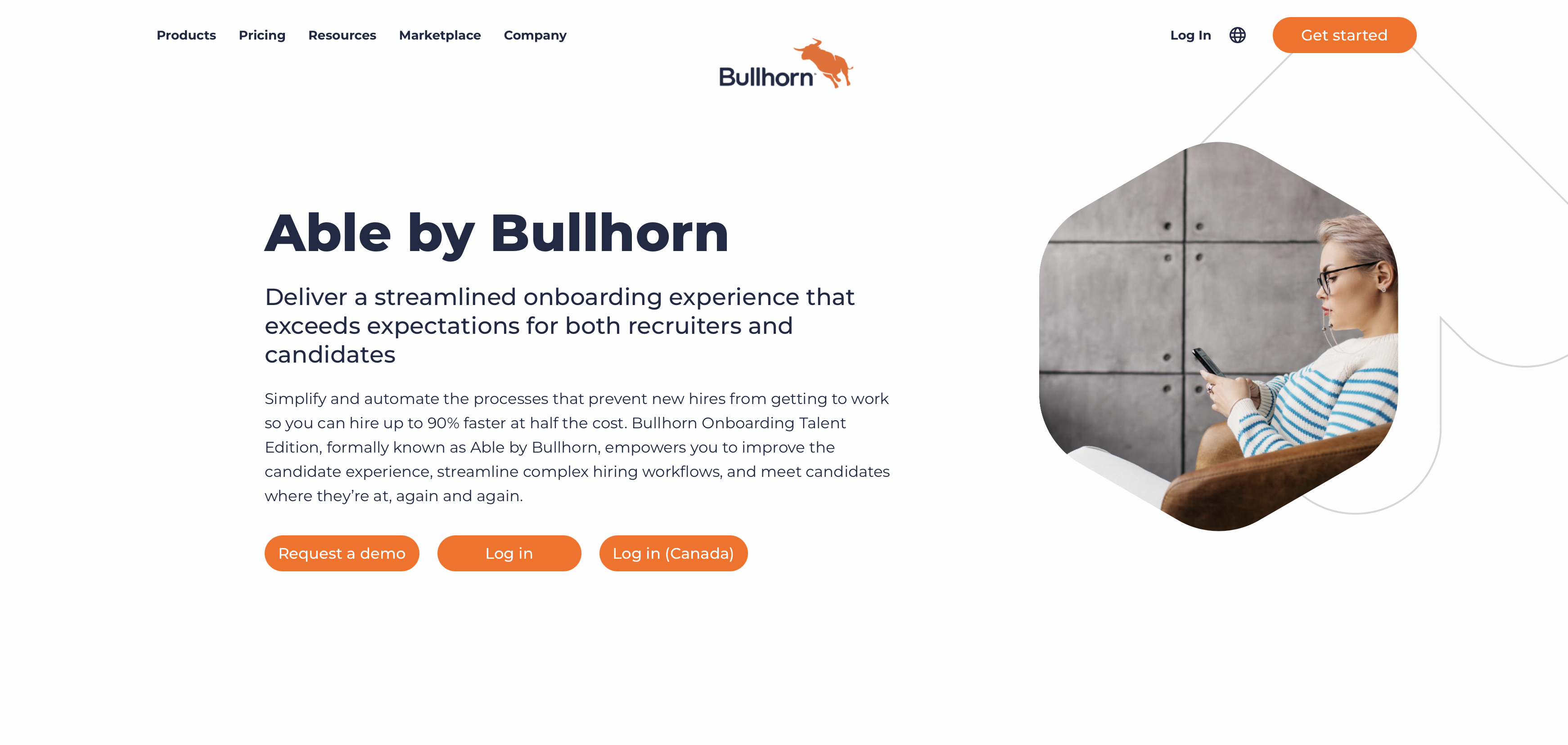
Able didn’t just get a new name. They got a brand powerful enough to carry them to the next stage of their journey. They certainly lived up to their new name.
All work © Krista Brown